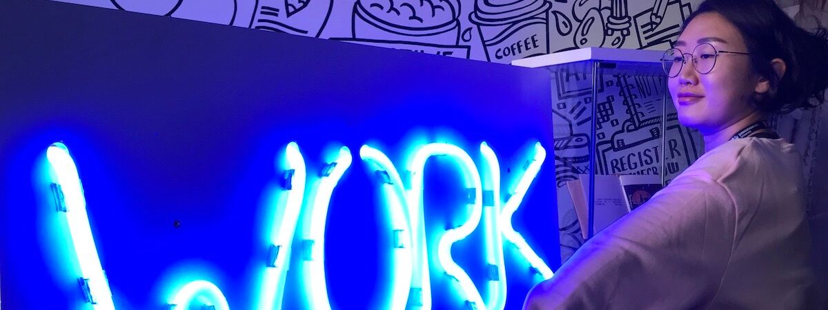
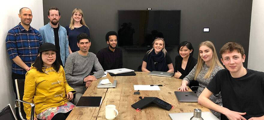
BA (Hons) Graphic Communication students recently had the opportunity to visit McCann London to pitch ideas they had for a brief set by the digital and advertising agency.
The brief came off the back of the launch of McCann’s Visibility93 campaign, which aims to change perceptions around disability and raise awareness of the millions of people worldwide living with conditions such as arthritis, Alzheimer’s and diabetes, who may not be considered to be disabled by onlookers.
Up until now accessible services have been identified by the International Symbol of Access (also known as the wheelchair symbol). It’s found in facilities such as parking bays, toilet doors and on public transport signage and indicates the facility is accessible for those with disabilities, or solely for their use. The symbol celebrated its 51st anniversary this year, having been designed by Danish design student Susanne Koefoed in 1968 and many people feel it should now be updated to reflect those with “invisible disabilities”, i.e. those who aren’t in a wheelchair or whose condition can’t be seen.
As a starting point to create awareness for invisible disabilities McCann created a number of icons for some of the most common ones. They then put a call out to designers and illustrators to help them to create a new International Symbol of Access, which is where our students came in.
Students worked on designs for the brief and went to McCann London to pitch their ideas and find out more about the agency.
Speaking about the experience, student Kai Steele commented:
McCann staff gave students feedback on their work and offered suggestions for how to further develop students’ ideas. The pitch led to a bigger conversation about the challenges of creating one universal symbol and how to progress with the brief. McCann hope to eventually approach the International Organisation for Standardisation (IOS) in Belgium with a new concept for an icon that represents disabled access, which Art Director Liam Riddler commented “needs to be an evolution rather than a revolution of the existing wheelchair icon”.
Students left the agency feeling energised and with plenty of ideas of avenues to explore when considering the new symbol. Kai added how useful it was to have been able to take a tour of the agency during their visit:
Find out more about how students have worked with industry by visiting our course pages or joining us at an Open Day.